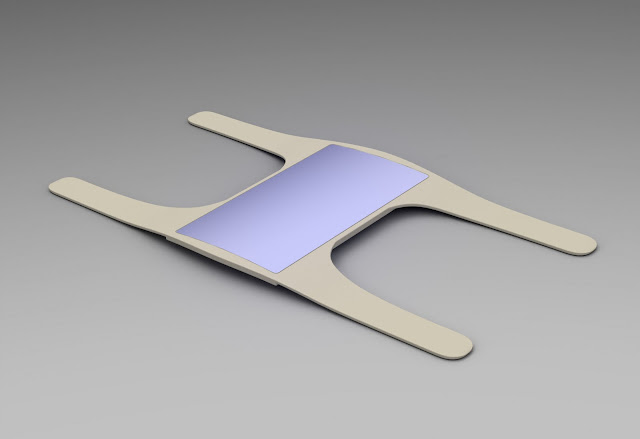
Shown here are some photos of interface designs that Marco, Brett, and I have been working on. You'll also notice that the wrist device's form has been given subtle modifications, such as rounded interior corners. The goal with this updated interface design is to make the content as simple and understandable as possible, since the icons and text in the previous designs was way too small. The rule of thumb we've been going with is that you should squint or purposefully blur your vision while looking at it, and if you can't see it, then nurses won't always be able to see it. The interface for this reason includes simple icons with large numbers, as well as a clean and professional white body colour and sky blue touch-screen.


No comments:
Post a Comment